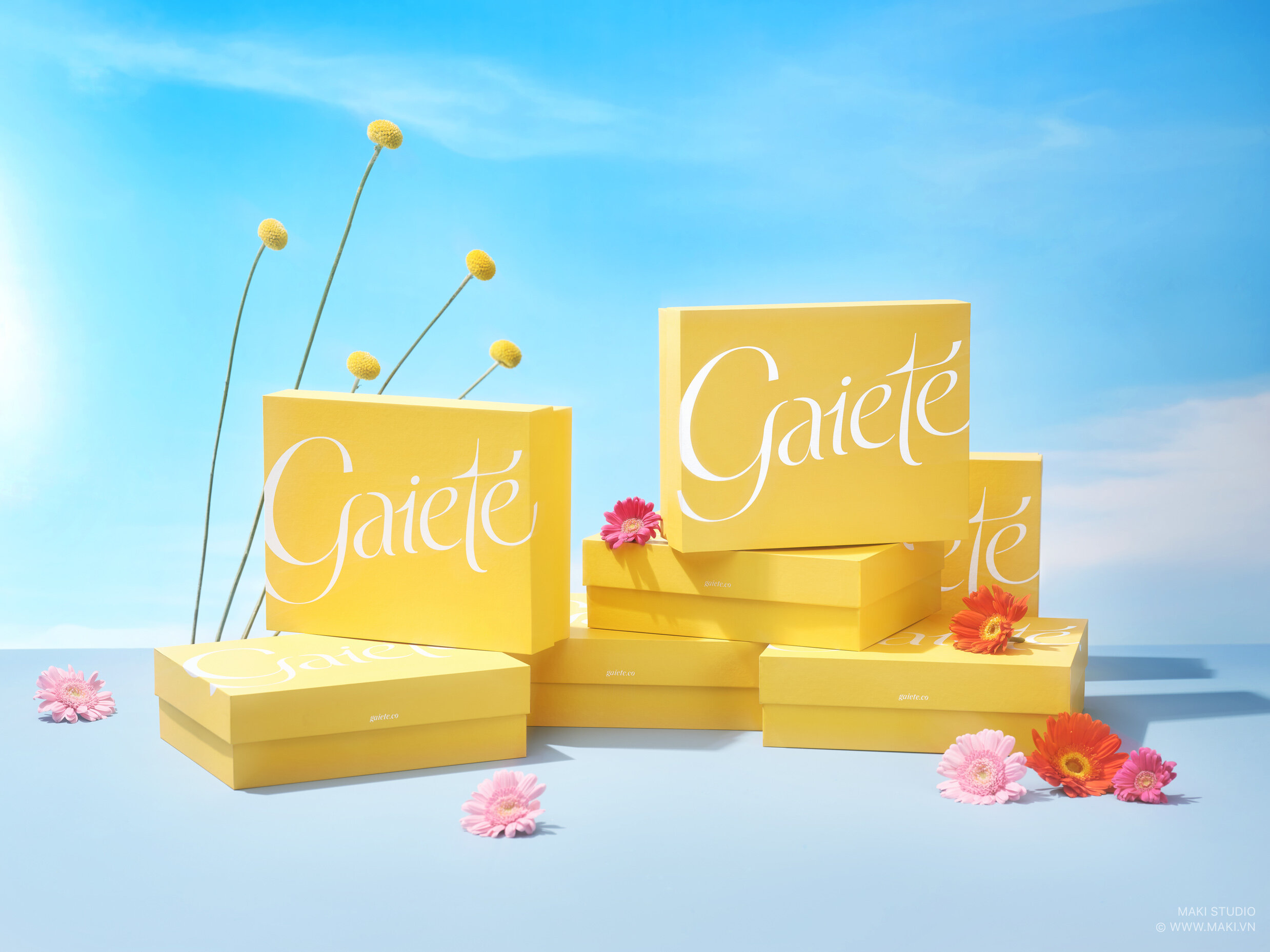
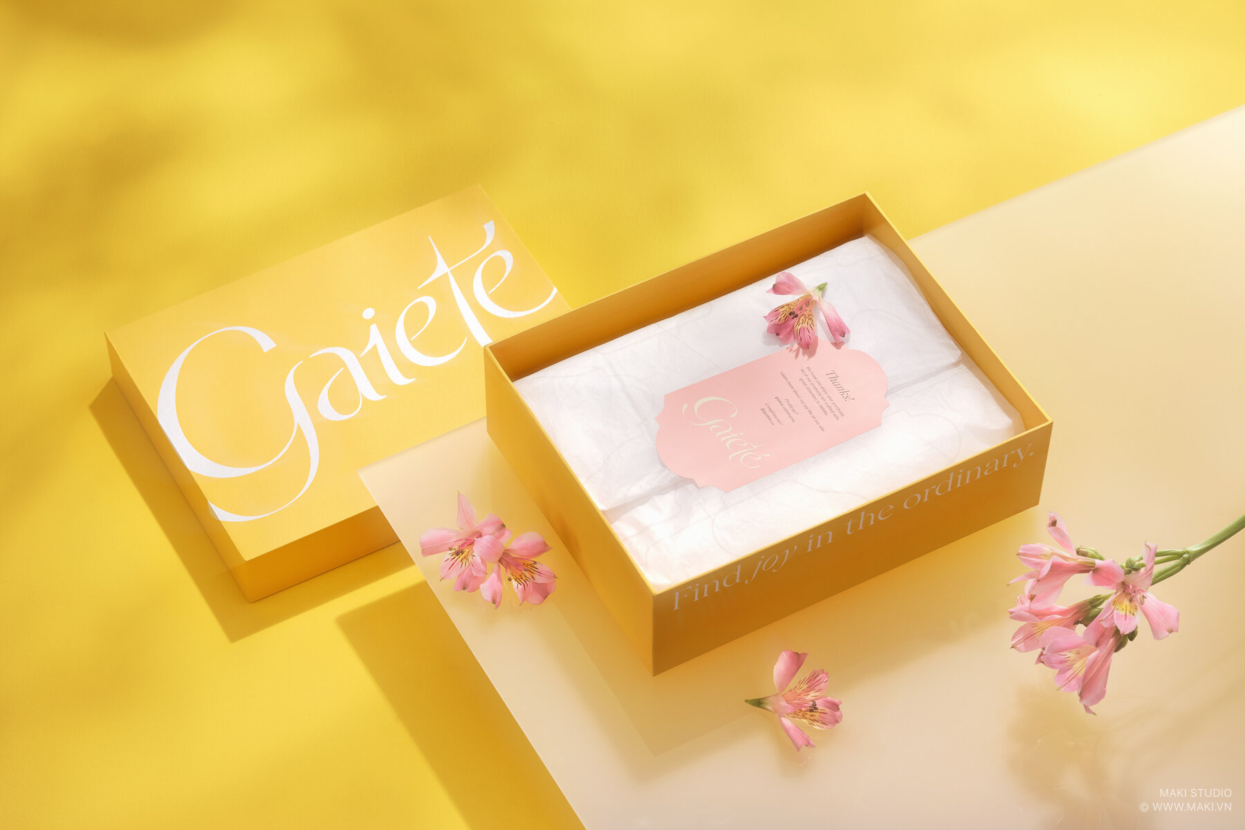
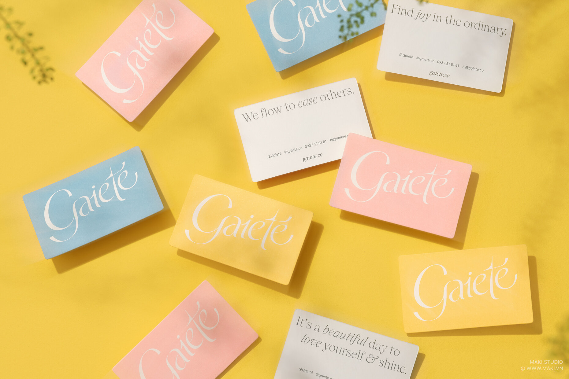
Gaieté celebrates femininity through an elegant and happy-go-lucky personality with branding by M — N Associates.
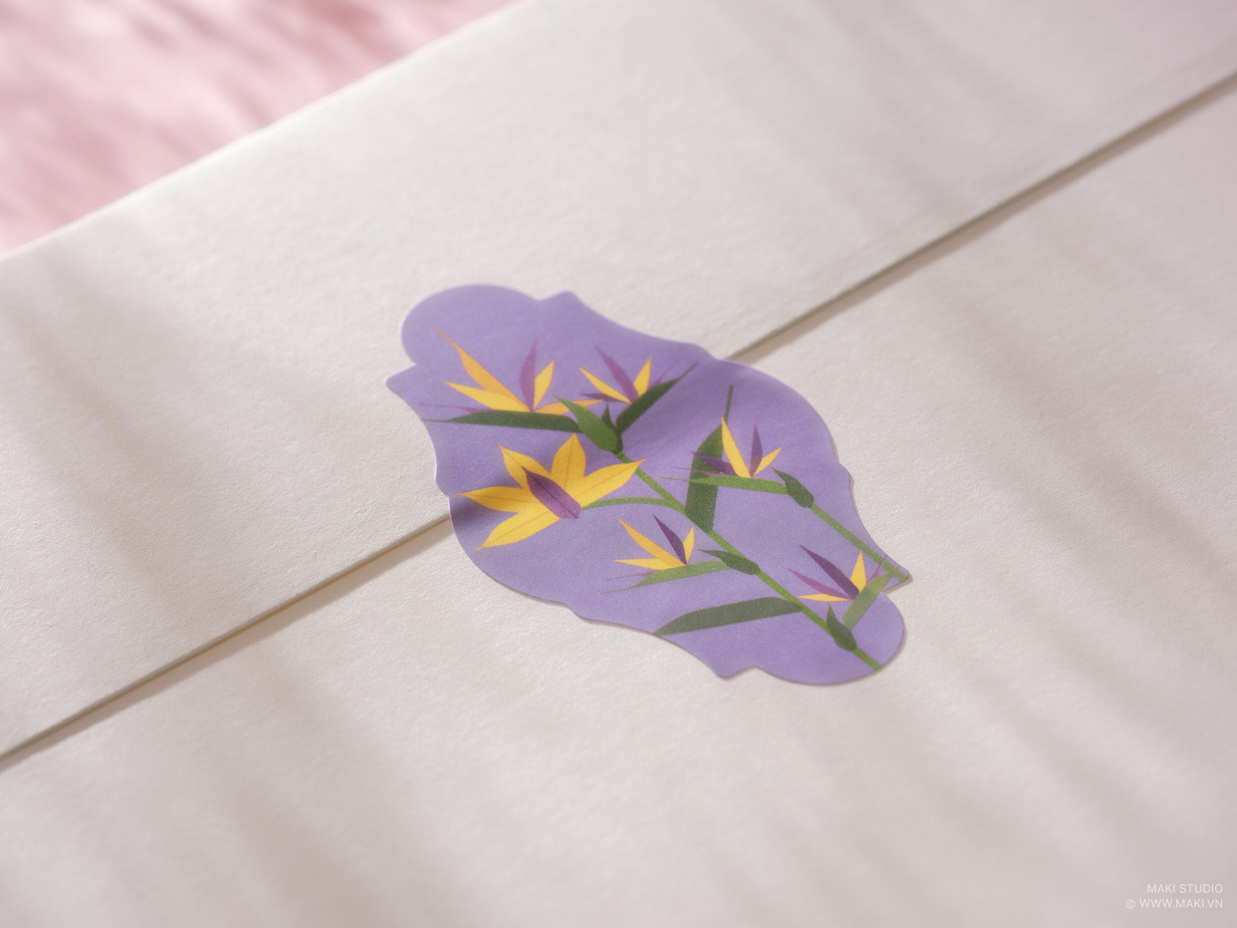
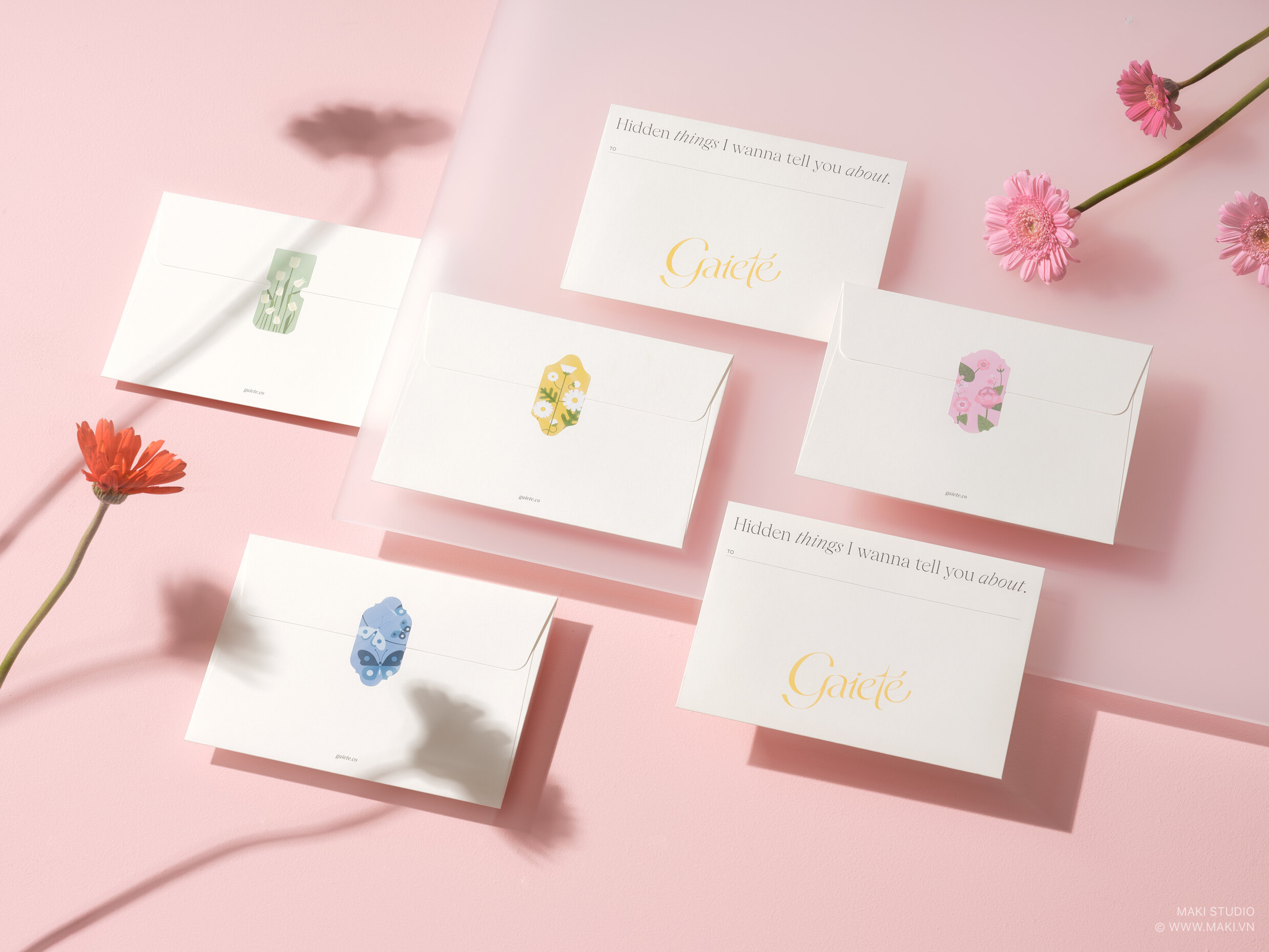
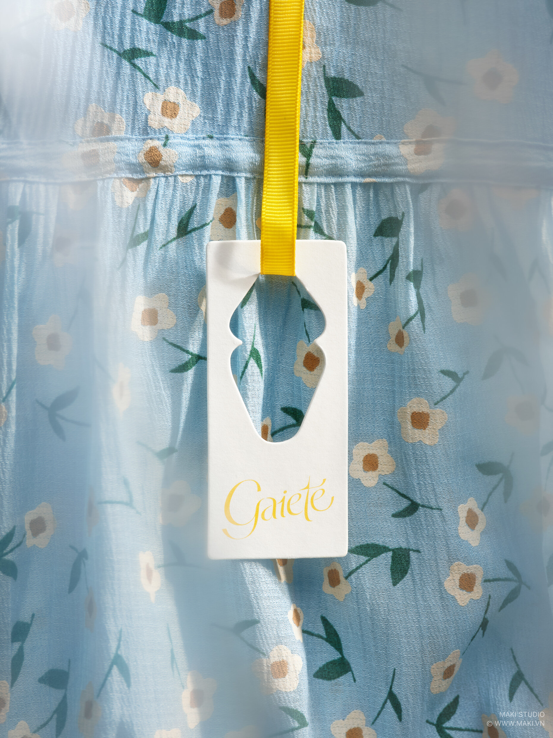
The brand has pristine and feminine packaging through soft typography, botanical illustrations, and a color palette full of whimsy.
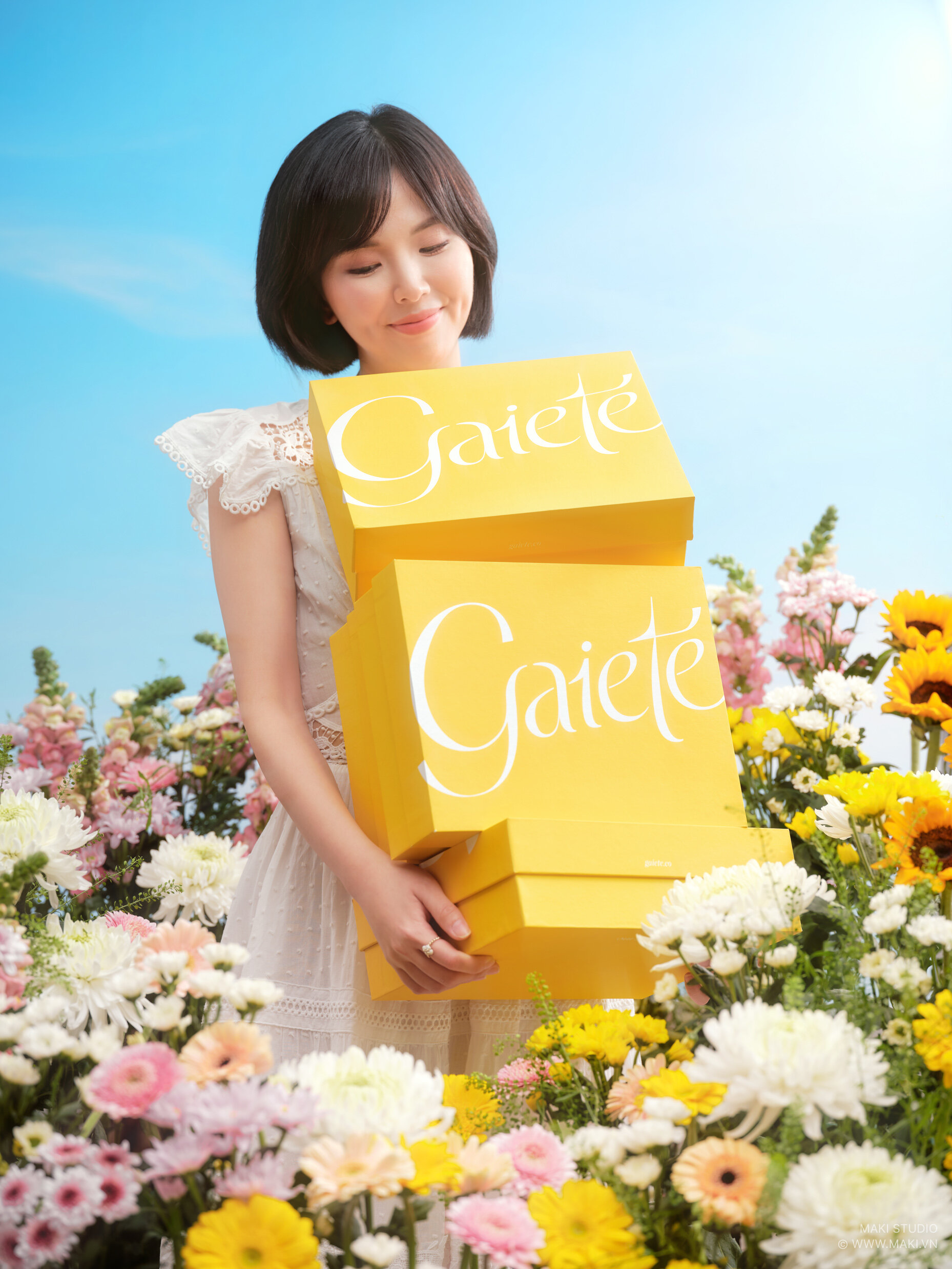
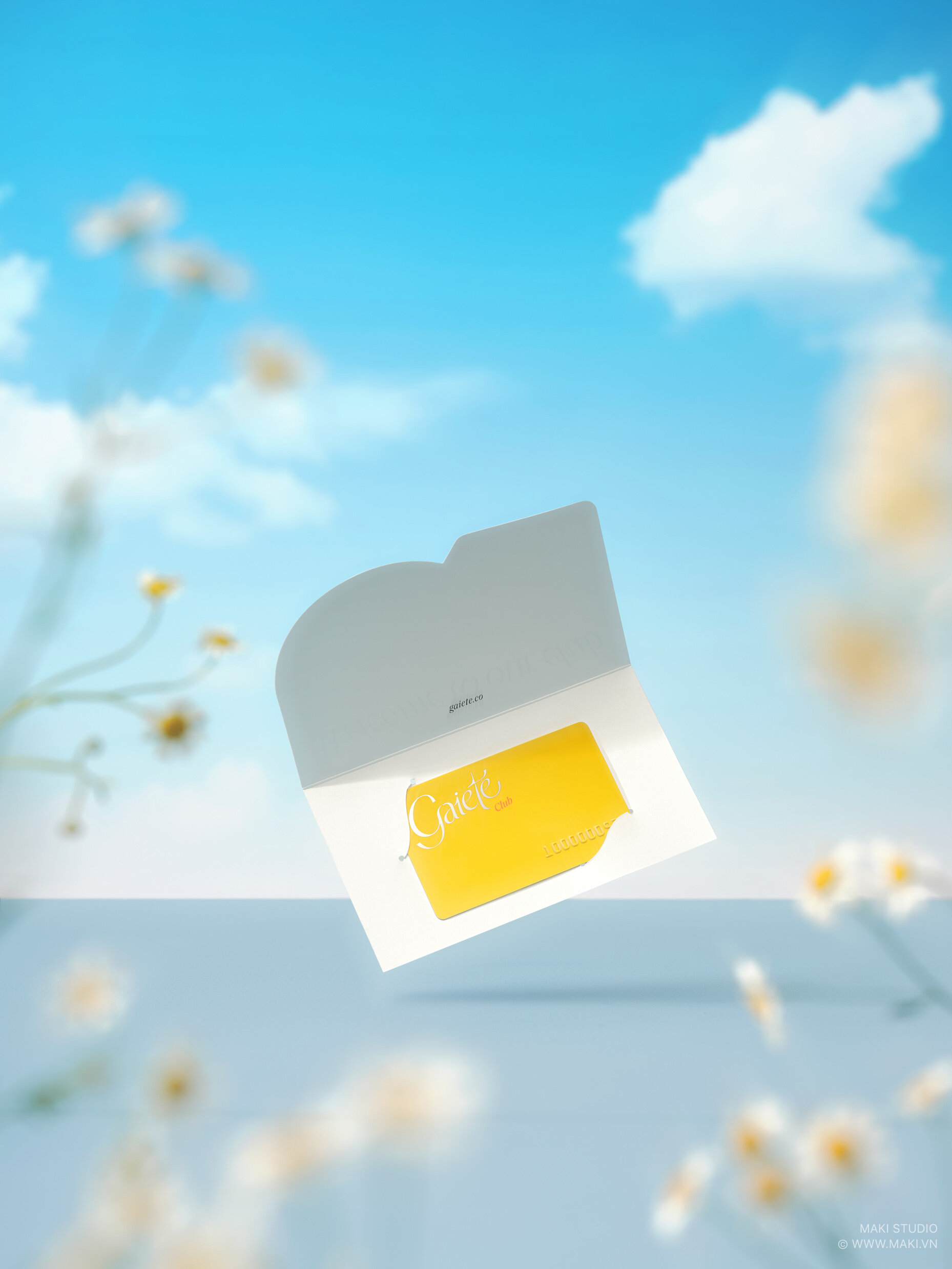
The logo's script font illuminates the brand's whimsical side on the outside of the packaging, and in combination with the yellow packaging, you can't help but feel filled with joy.
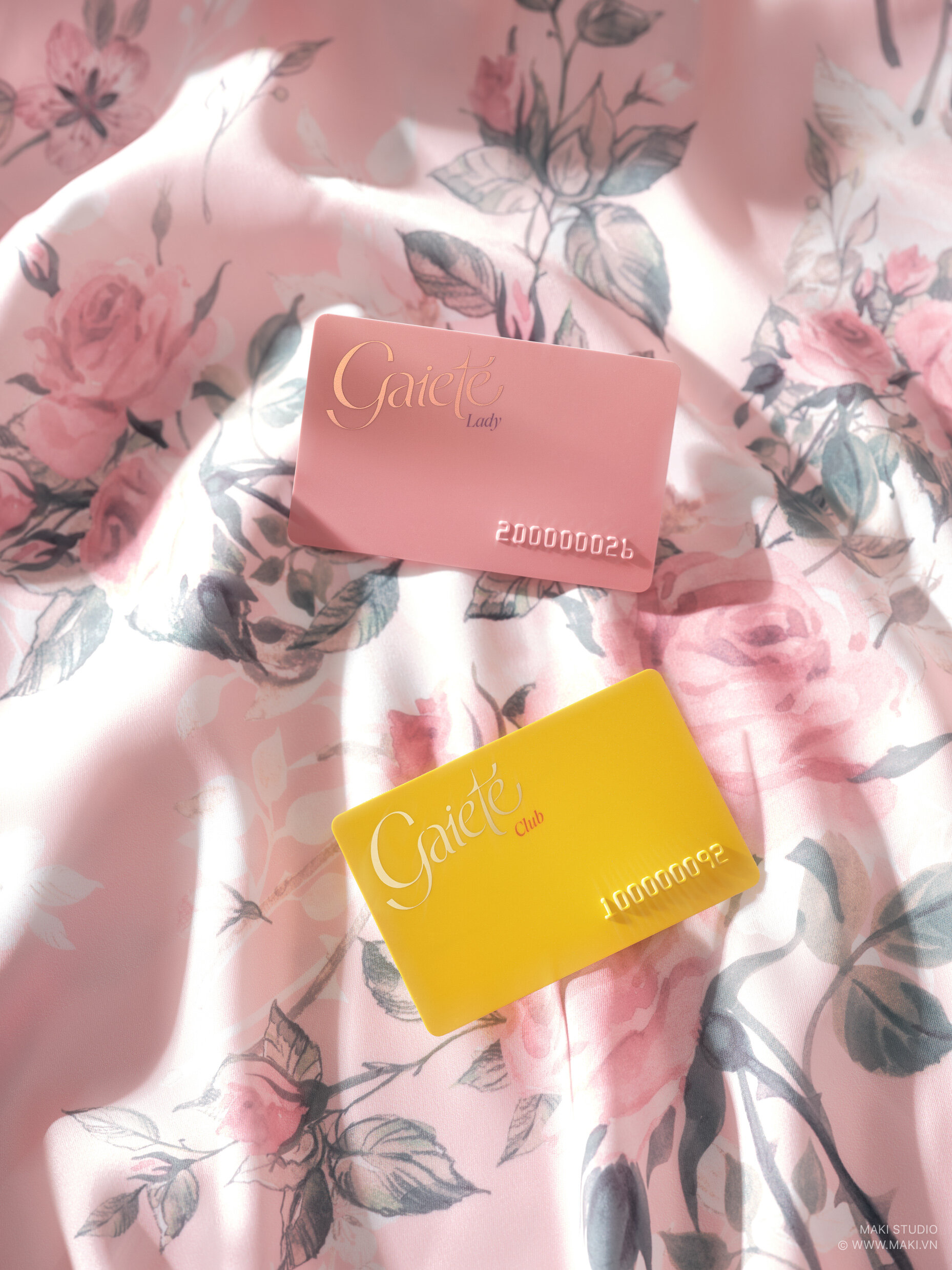
Gaieté is special in that it has a unique aesthetic that stays true to daintiness and sophistication throughout its entire branding system while still keeping its extensions of the branding memorable yet exclusive.